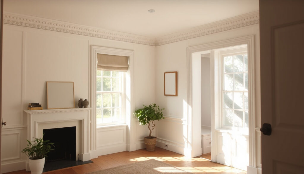
Farrow & Ball Shaded White: Color Guide & Undertones
Pick a paint colour for a north-facing room and you’ll quickly discover that most whites turn into a cold, flat disappointment. Farrow & Ball’s Shaded White No. 201 sidesteps that trap with a quiet trick: a green undertone that keeps it soft, warm enough to feel cosy, but never yellow.
Color Name: Shaded White No.201 ·
Undertone: Green – soft grey with green undertones ·
Official Description: “Gentle greyness, but with none of the cooler tones of Cornforth White” ·
Versatility: Incredibly versatile in both old and new homes ·
Tone: Neither too warm nor too cool
Quick snapshot
- Shaded White has a gentle greyness (Rabart, paint retailer)
- It is neither too warm nor too cool (Rabart)
- It is incredibly versatile in homes both old and new (Rabart)
- Exact LRV (Light Reflectance Value) – not officially published by Farrow & Ball
- Precise RAL code – not provided by the brand
- Dulux equivalent – no official cross-reference
- Whether Shadow White is officially darker – no direct data
- No timeline data – Shaded White is a permanent colour in the Farrow & Ball range
- Check the official Farrow & Ball white colour schemes guide for pairings
- Order a sample pot to test in your own lighting (Farrow & Ball white colour schemes guide)
Shaded White’s key facts center on its neutral undertone.
| Label | Value |
|---|---|
| Full Name | Farrow & Ball Shaded White No.201 |
| Undertone | Green – soft grey with green undertones |
| Official Description | Gentle greyness, no cooler tones of Cornforth White |
| Tone | Neither too warm nor too cool |
| Versatility | Incredibly versatile in old and new homes |
| Sample Pot Size | Available as sample pot (handcrafted) |
What color is Farrow and Ball shaded white?
Describing Shaded White
Shaded White is a soft grey with a subtle green undertone — not a pastel green, but a muted, earthy note that keeps the colour from feeling stark. Farrow & Ball describes it as having a “gentle greyness, but with none of the cooler tones of Cornforth White” (Rabart, quoting official product description). The name itself comes from the soft tone that appears when many Farrow & Ball whites are used in deep shade, according to paint retailer Rabart.
Color Characteristics
- Neither too warm nor too cool — sits in a balanced middle ground.
- Incredibly versatile in both old and new homes (Rabart).
- Pairs well with both warm and cool tones due to its true neutral base.
Light Reflectance and Perception
Farrow & Ball does not publish an official Light Reflectance Value (LRV) for Shaded White. Third-party matching sites like Match That Paint (paint matching service) estimate an LRV of 63, which would place it in the light-to-medium range. The same site describes the undertone as “soft gray beige,” while Composite Paint (another matching service) lists the undertone as red-orange / warm — a discrepancy that underscores the importance of testing a sample in your own light.
Homeowners relying on third-party LRV data risk mismatched expectations. The only dependable way to judge Shaded White’s depth is to paint a large sample board and view it at different times of day.
The pattern: third-party data can conflict, so sampling is non-negotiable.
What are the undertones of Farrow and Ball shaded white?
Green Undertone Explained
Shaded White’s defining characteristic is a green undertone that is present but not overpowering. Farrow & Ball’s own white colour scheme guidance explains that the brand’s whites are not simply white — they have subtle undertones that create depth, character, and complexity (Farrow & Ball, official white colour schemes page). Shaded White sits in the off-white group that includes Shadow White and Drop Cloth, all created to “look like white when used in deep shade” (Rabart).
How Undertone Appears in Different Lighting
- In north-facing light: the green undertone softens the cool grey cast, preventing the colour from looking flat or blue.
- In south-facing light: the warmth of the sun brings out the grey base, making it appear more neutral.
- In artificial warm light: the green note can read as a muted olive, especially beside stark white trim.
Comparison with Other Farrow & Ball Whites
Farrow & Ball groups its whites into warmer whites with red undertones (e.g., Joa’s White, Archive, Pointing) and cooler whites with blue undertones (e.g., Cabbage White, Sizing) (Farrow & Ball). Shaded White does not fit neatly into either camp — its green undertone occupies a middle territory. The brand also highlights School House White and Wimborne White as “special whites that complement almost every colour scheme” (Farrow & Ball). Shaded White is not listed as a special white, but its balanced tone makes it a strong candidate for rooms where neither a warm nor cool white feels right.
For anyone choosing between a warm white (like Pointing) and a cool white (like Cabbage White), Shaded White offers a third path: a green-leaning neutral that adapts to both palettes without fighting them.
Which is darker, shaded white or shadow white?
Shaded White vs Shadow White
Shadow White No.282 is a different colour from Shaded White. Based on the naming convention, “Shadow” suggests a darker, more recessive tone, while “Shaded” refers to the effect of shade on white. Third-party colour conversion data lists Shaded White with a hex value of #D9D2C1 and Shadow White with #DED8C6 (Converting Colors, colour conversion database).
Hex values confirm that Shaded White is the darker of the two off-whites.
| Property | Shaded White No.201 | Shadow White No.282 |
|---|---|---|
| Official Name | Shaded White | Shadow White |
| Hex (from Converting Colors) | #D9D2C1 | #DED8C6 |
| Relative Lightness | Darker (lower RGB values) | Lighter (higher RGB values) |
| Undertone | Green – soft grey | Warm – yellow/beige (based on discussion) |
| Best Use | North-facing rooms, shaded spaces | South-facing rooms, areas needing warmth |
When to Choose Each
If you want a colour that feels like a soft, natural white in a dim room, Shaded White is the better pick. Shadow White, being lighter and warmer, works well in bright rooms where you want to avoid a cold cast. The catch: without official Farrow & Ball data, these comparisons rely on third-party measurements, so testing both side by side is essential.
The pattern: Shaded White is the darker, greener sibling; Shadow White is the lighter, warmer one. For a north-facing room, Shaded White’s green undertone will feel more grounded than Shadow White’s warm yellow.
What color goes with Farrow and Ball shaded white?
Complementary Colors
Shaded White’s green undertone opens up a wide range of pairings. Because it is neither too warm nor too cool, it acts as a bridge between colour families. House Beautiful UK groups Shaded White with Slipper Satin as a “strong off-white pairing for homes with wood, antiques, or brown tones” (House Beautiful UK, interior design magazine).
“Shaded White is a strong off-white pairing for homes with wood, antiques, or brown tones.”
- Deep greens (e.g., Farrow & Ball’s “Green Smoke” or “Calke Green”) — intensify the green undertone.
- Navy blue (e.g., “Hague Blue”) — creates a crisp, classic contrast.
- Soft pinks (e.g., “Setting Plaster”) — warms up the grey-green base.
- Warm neutrals (e.g., “Elephant’s Breath”) — keep the scheme tonal and sophisticated.
Best Color Schemes
For a living room, try Shaded White on walls with a deep green feature wall and natural wood furniture. In a bedroom, pair it with soft pink or blush linens and white trim. The DIY colour-card PDF from B&Q says every colour in the Farrow & Ball palette is paired with a specific shade of white to “celebrate a shared undertone and create harmonious spaces” (B&Q / Kingfisher, Farrow & Ball colour card PDF).
“Every colour in the Farrow & Ball palette is paired with a specific shade of white to celebrate a shared undertone and create harmonious spaces.”
Using with Neutrals and Bold Accents
Shaded White works as a backdrop for both neutral and bold accents. Because it has a green undertone, it avoids the flatness of pure white and the yellow cast of cream. It pairs especially well with B&Q paint ranges for trims and ceilings, as long as you stick to a true white with no yellow undertone.
Homeowners in Ireland and the UK, where north-facing rooms are common, can use Shaded White as a base that doesn’t force a warm/cool decision — it adapts to whatever accent colours you bring in.
What is the best warm white that doesn’t look yellow?
Understanding Warm Whites
Shaded White is not a warm white — it is a soft grey with a green undertone. If you need a warm white that avoids yellow, Farrow & Ball offers several options. The brand’s white guidance cites Joa’s White, Archive, and Pointing as warmer whites with red undertones (Farrow & Ball).
Top Warm White Paint Colors
- Wimborne White – a soft, clean white with no yellow, often described as the most neutral warm white in the range.
- Pointing – a warm white with a red undertone that feels creamy but not yellow.
- School House White – a special white that complements almost every colour scheme, according to Farrow & Ball.
How Shaded White Compares
Shaded White sits in a different category: it is an off-white with a green undertone, not a warm white. If your goal is a white that feels warm without yellow, choose Wimborne White or Pointing. If you want a white that feels neutral and slightly earthy, Shaded White is the better choice. The difference is subtle but critical — especially in rooms where you plan to use bold accent colours.
The trade-off: warm whites with red undertones can look pink in certain lights, while Shaded White’s green undertone stays neutral. Test a sample of each before committing.
Confirmed facts
- Shaded White has a gentle greyness (Rabart)
- It has green undertones (Rabart)
- It is not too warm or too cool (Rabart)
- It is versatile in both old and new homes (Rabart)
What’s unclear
- Exact LRV (Light Reflectance Value)
- Precise RAL code
- Dulux equivalent
- Whether Shadow White is officially darker (no direct data)
“Farrow & Ball’s whites are not simply white — they have subtle undertones that create depth, character, and complexity.”
Farrow & Ball, official white colour schemes page
Shaded White’s green undertone is the key to its adaptability. For homeowners in Ireland and the UK who face the perennial challenge of north-facing rooms, this colour offers a neutral that doesn’t go cold. The implication: if you’ve been frustrated by whites that look blue or yellow, Shaded White is worth a sample pot. For anyone planning a kitchen or bedroom makeover, the choice is clear: test Shaded White against your existing trim and furniture, or risk a mismatch that no amount of lighting can fix.
farrow-ball.com, chatelaine.com, youtube.com, bydesignandviz.com
Frequently asked questions
Is shaded white a warm or cool color?
Shaded White is neither warm nor cool — it sits in the middle with a green undertone. It is not a warm white like Wimborne White nor a cool white like Cabbage White.
What is the LRV of shaded white?
Farrow & Ball does not publish an official LRV for Shaded White. Third-party sites estimate it around 63, but this is not confirmed by the brand.
Can I use shaded white in a north-facing room?
Yes, Shaded White is an excellent choice for north-facing rooms because its green undertone prevents the cold, flat look that many whites get in low light.
Does shaded white look blue?
No, Shaded White does not have blue undertones. It is a soft grey with green undertones, so it avoids the blue cast of cooler whites like Cabbage White.
What is the difference between shaded white and strong white?
Strong White is a warmer, creamier white from Farrow & Ball, while Shaded White is a soft grey with green undertones. Strong White has a more yellow-based warmth.
What is the best way to apply Farrow and Ball paint?
Farrow & Ball recommends using its Primer & Undercoat in the appropriate tone (White & Light Tones for Shaded White) before applying the topcoat (Farrow & Ball, primers & undercoats guide). Apply two coats of topcoat for best results.
Is shaded white a good choice for a bedroom?
Yes, Shaded White works well in bedrooms because it creates a calm, neutral backdrop. Pair it with soft pinks or warm woods for a cosy feel.
More related posts
 Mullery O’Gara Estate Agents: Reviews, Properties & Regulations
 Nikolaj Coster-Waldau: Career, Family, and Personal Life
 What Time Does Tesco Close At in Ireland? Hours Guide
 Exhaust Repair Near Me: Costs & Dublin Options
 TUI SUNEO Santa Ponsa: Honest Hotel Reviews & Guide
 Mireille Mumpuni: Student Nurse Spared Jail for Illegal Entry
 Little Tikes Story Dream Machine: Age, Features & Reviews
 Setting Up a Company in Ireland: Costs, Steps, and Requirements
